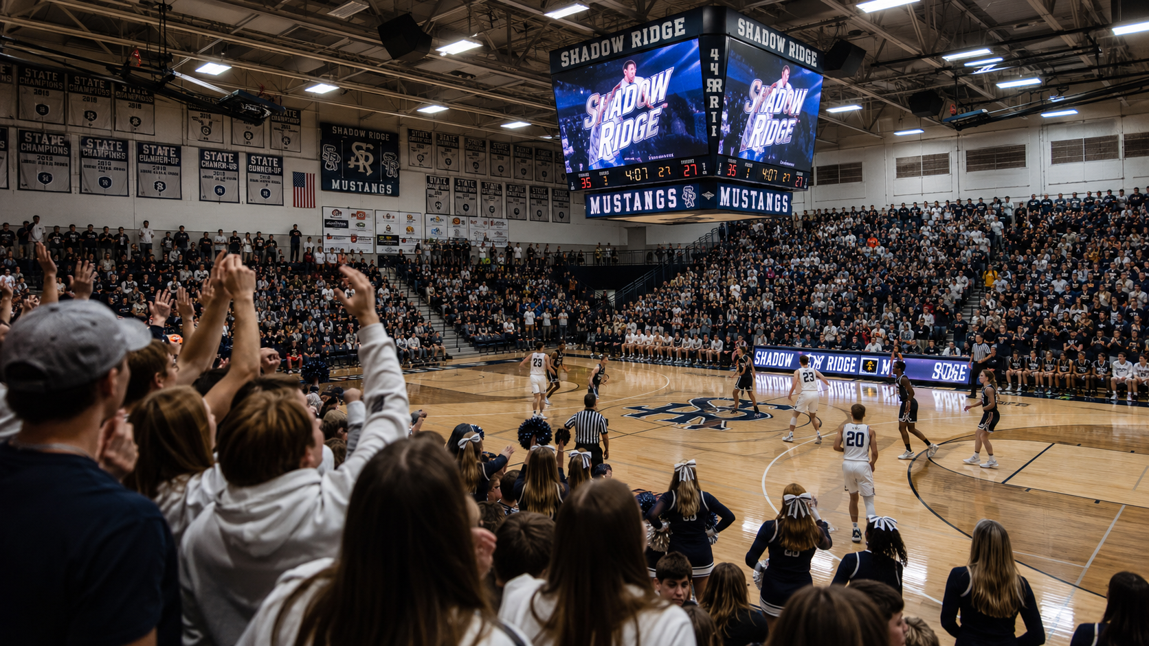
At Gipper, our top priority is speed. We want to get you in and out of a template as quickly as possible so that you can go on to the bigger and better things that your job entails. That's why you'll hear us say that you can create your graphics in seconds just by updating your media, changing your colors, and adding your text.
BUT, we also want you to be creative! Which is why we also have a ton of editing features that can unlock even more design possibilities. If you have an extra few minutes and want to play around with some more "advanced" graphic design techniques, here's what you should try out.
Filters
What are they?
A photo filter is a template that has pre-set photo settings like contrast, color balance, and saturation. Filters allow you to edit the look of your photo without manually changing multiple settings.
For example, a common photo filter is "black and white." Instead of having to adjust the color balance and contrast of your photo to create the black-and-white look, the filter adjusts it in one click.
When to use them?
- Make other elements "pop." Filters mute some of the colors in your photos and can create a nice monochromatic look. That helps other more colorful elements, like text or cutouts, stand out on your graphic. Try using the black-and-white filter on your photos, but add a pop of color to your text. That can help visually call attention to the most important information on your graphic.
- Quick fix your photos. Maybe you don't have the best photo for your graphic. Maybe the lighting is too dark or there's an unwanted glare. Certain filters can adjust elements of your photo like contrast and saturation, which can be a quick fix for your photos.
Opacity
What is it?
Technically, opacity is the measure of how much light passes through an object. In graphic design, opacity is what allows us to control how transparent an element is. In other words, how much can you see through an element?
If opacity is at 100%, that means it's not transparent at all. If it's at 0% opacity, it's completely transparent.
Opacity is an important feature of graphic design because it creates depth. Adding depth to your graphics can make them much more visually interesting and engaging to a viewer.
When to use it?
- Layering photos. Using background photos over cutouts or other photos creates depth in your graphic. Take the opacity of your background photo way down so that your cutout or other design elements really stand out.
- Logo overlays. This technique is a Gipper fan favorite. Add an additional logo and create depth in your graphic and give your graphic a textured look with a logo overlay. Add your logo, scale the size up, and turn the opacity way down.
- Bonus: Color opacity. Gipper also has opacity controller built in for certain colors, like Background colors. This allows you to easily add color treatment to your photos. The effect is similar to blend color (see below).
Blur
What is it?
Blur controls the clarity of an image. The more blur you apply, the less distinct your photo or image will appear.
Blur can help certain elements stand out much more. For instance, maybe you want to add text over a photo but you can't see it very well. Blurring the photo a bit can make that text stand out and be more legible.
When to use it?
- Background photos. We love background photos because they help add depth to graphics, but we never want them to be the star of the show. Blurring these photos helps add depth and context without being too distracting.
- Cutouts. Cutouts already stand out on your graphics, but you can make them pop even more by blurring the background of the photo they come from.
Blend Color
What is it?
Blend color allows you to combine a design element, like a photo, with a color. Different blend modes will then define how the photo and the color combine. This results in an image that has a color effect.
When to use it?
- Color overlay/filter on photos. If you're looking to give your photo a bit of a filter treatment but aren't feeling the ones we have available, blend color is a great alternative. Choose one of your official school colors to use as the blend color, and give the photo itself a bit of branding. It can also create a really nice monochrome look that pops on social media.
- Monochrome effect. Applying blend color on a photo can create a cool monochrome look. Doing this can also help the other elements, like text, on your graphic really stand out.
Drop Shadow
What is it?
Drop shadow is a darkened tint that creates a shadow behind a design element, giving it a 3D appearance. Drop shadow is key in giving depth to your design, allowing elements to look as if they are "raised" above others on your image.
When to use it?
- Text. Drop shadow is a very tactical way to make text stand out. You might have a photo in your background that has a lot going on, either with color or texture. Maybe changing the color of your text still isn't enough for it to really be seen on the background of your photo. Adding drop shadow is a simple solution to this. It further contrasts your text from your image and gives both elements the appearance of separation.
- Logos & cutouts. The same goes for logos and cutouts. If you want to add more contrast between your logos or cutouts and your background, add a drop shadow.
Warning: Design Responsibly!
These editing techniques are a lot of fun, but they can go from elevating your design to overtaking it pretty quickly. The goal of each of these features is to enhance your design, not define it. When it comes to advanced editing features, less is more. Always ask yourself, "Does my graphic need this?"
And, if you ever need help or want a second set of eyes, you can reach out to the Gipper team! We're always happy to help.


.png)


.webp)